
March 31, 2026
Beyond the Software: Essential Soft Skills for the Modern Designer
Ms. Bashayer AlMahdi

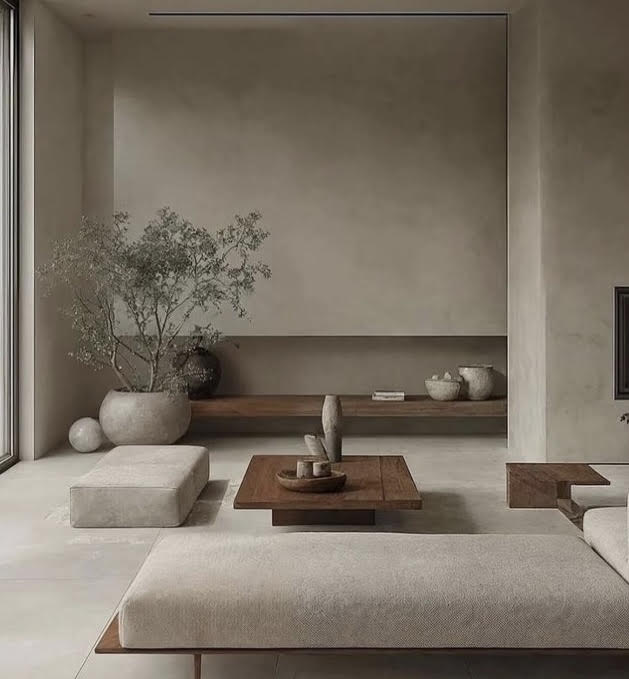
Colors & Interiors — An enduring trend, a style that’s lasted too long, or an emerging “chromophobia” in disguise? Exploring the dominance of neutral palettes in contemporary interior design.
An observer of today’s interior design landscape cannot overlook the growing dominance of neutral and monochromatic color palettes. This prevailing trend reflects a broader shift toward understated elegance, visual calm, and timeless aesthetic expression in contemporary interior environments.
To understand the omnipresence of these dull hues, we need to take a detour back to the 1920s, with the creation of the Bauhaus movement known for its non-colors and use of raw materials. The trend became increasingly pronounced from the 1980s onward and continues to shape contemporary interiors today. Walls are often rendered in white, while furniture is dominated by shades of gray, taupe, and other muted tones. Spaces are articulated, connected, or subtly divided through the use of neutral elements, reinforcing a cohesive and understated spatial language.
In the literature, as in user-experience design or sensory design defining a relationship with the color of interior space through perception, chromophobia is defined as “the rejection of color.” According to David Batchelor, who studied this phenomenon in his book Chromophobia (FOCI, 2000), he lists three reasons for this trend:
Designers and clients often default to safe, neutral choices rather than embracing bold color statements.
Industry trends and mass production have normalized muted palettes as the universal “safe” option.
Over-reliance on neutrality can reflect a creative limitation rather than a conscious design philosophy.
Nonetheless, it’s important to remember that colors in interior spaces have an essential socio-cultural dimension, and that the spaces that surround us have a strong impact on our intellection and well-being, essentially by and through color, which has an undeniable psychological impact on our mood. It is therefore important to reconsider color as a central issue in our interior design projects, to recapture a lost boldness and reinvent new models of thinking.
The dominance of neutral tones in contemporary interiors reflects more than just a stylistic preference—it signals a deeper cultural and psychological shift in how we perceive space, comfort, and identity. While minimal palettes offer calmness and cohesion, over-reliance on them risks suppressing creativity, emotional richness, and sensory engagement.
The concept of chromophobia challenges designers to question whether neutrality has become a safe default rather than a conscious choice. Color is not merely decorative—it shapes mood, influences perception, and defines human experience within space.
For institutions like Gulf University, this opens an important dialogue in design education: to encourage bold thinking, reintroduce meaningful color use, and balance modern minimalism with expressive design language.
The future of interior design lies not in abandoning neutrality, but in mastering contrast—where calm meets character, and simplicity coexists with vibrant identity. Design beyond the safe palette—embrace color intentionally to create spaces that inspire, energize, and truly resonate.
Dr. Omar Blibech
Gulf University, Kingdom of Bahrain
Last Updated: 09 Apr 2026